Yep, pretty freaking sweet. From Restyleshop.etsy.com
Showing posts with label Illustration. Show all posts
Showing posts with label Illustration. Show all posts
Sunday, May 15, 2011
Friday, April 15, 2011
Oxford Urban Farm
Tuesday, April 12, 2011
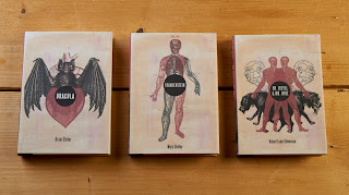
Book Jackets
My pride and joy. I redid my book covers over winter break and couldn't be happier with how they turned out. I created collages from old medical textbooks that depict the main character of each story.
Saturday, February 12, 2011
Thursday, February 10, 2011
Tuesday, February 8, 2011
Monday, January 3, 2011
Beer Print
My husband and his brother have been home-brewing beer for over 6 months now and I loved the look of this print, Doublenaut by Andrew and Matt McCracken.
Thursday, December 23, 2010
Ink and Wit
Ink and Wit does beautiful letterpress and offset printing of cards, gift wrap, notecards and more. They also do design and web work. You can download the portfolios and take a look.
Tuesday, December 14, 2010
Charlie Harper
Charlie Harper (1922-2007) was an prolific illustrator who worked for Ford Motor Company’s magazine, Ford Times, as well as many conversation-oriented organizations such as zoos and national parks. His works are mostly of nature - birds, fish, bugs, cats and much more.
Images from charleyharperprints.com
Purl Soho has Charlie Harper needlepoint kits!
Other fun Charlie Harper goodies:
Monday, November 22, 2010
No Coast Craft O Rama 2010
This poster designed by Sara Lintner of Too Many Suitors is gorgeous! I'm really bumed that I had to turn it down this year but I couldn't be happier that my good friend Kelly of Table Tin will have a table!
Friday, November 19, 2010
Swatch Books
We just did a project where we were to design a series of three related paper swatch book covers. The theme was plants and the typography was to work with any supporting images.
I have to first show some gorgeous swatch books that French Paper has put together...
My three covers:
In a paper store I saw a stamp that looked like a very intricate flower. Upon closer inspection I saw it was actually a doily. I thought this was a brilliant way to create an abstract image of a flower and then play around with size and placement. I scanned three different doilys and then did a live trace in Illustrator. There is no transparency on these, but you still get an illusion of this with the optical blending of colors.
Monday, October 25, 2010
French Paper
Besides having gorgeous paper and equally gorgeous paper swatch books, French Paper also has a wonderful extensive collection of illustrations.
Monday, October 11, 2010
Design Books: Naive
Greatest Book Ever. An illustrators dream to look at. Naive is a collection of classical graphic designs that are a nod to the designs of the 40,s, 50's, and 60's. While certainly retro, there is a very modern feel with many of the works.
Saturday, October 9, 2010
The Zoo That Grew
Awesome find in the clearance dollar bin at Half Price Books.
Illustrated by Lisl Stich. Text by James Krüss. Published in 1970.
Illustrated by Lisl Stich. Text by James Krüss. Published in 1970.
Monday, September 27, 2010
Past Project: Farmers Market Ads
This project was from my Photoshop class a couple of semesters ago. The objective was to create two ads for the Minneapolis Farmer's Market that would be posted on the side of the city bus and at the bus stop.
Monday, September 13, 2010
Past Project: Coffee House Ads


This was a 3 part series of ads we created for a coffee house of our choosing. I choose Nina's in St. Paul which is in walking distance from home.
Two things were standing out to me when I did research for these ads. The first was that Nina's had this great eclectic mix of old furniture that made it unlike any chain coffee house you ever visited. The second thing that stood out was that a healthy two thirds of the customers stayed for long periods of time and worked or read while they sipped their beverages. This wasn't an in and out sort of coffee house. I wanted to capture both of those feelings in these ads.
Subscribe to:
Posts (Atom)


